 Debugger script
Dhtml css
Debugger script
Dhtml css
|
|
You can create page layouts using styles either in conjunction with tables or by themselves. The following sections provide brief introductions to doing both.
There are many advantages to using styles to control the appearance of tables and their content. When using the FONT element to set font characteristics for table content, for instance, you have to insert a FONT element inside each and every table cell where you want it to have effect. Using styles, however, a single style rule can set the display characteristics for all cells within a table. There are also special elements, the THEAD, TBODY, and TFOOT elements, that are designed specifically for use with styles.
For this example, you will be using a different example file. To get started with this example:
Open tutor8c_example.html in your text editor from your MyHTML folder (located in your My Documents folder, if using Windows, or on your Desktop, if using a Macintosh).
Resave tutor8c_example.html as tutor8c.html in the MyHTML folder.
Open tutor8c.html in your browser.
When not using styles to control the appearance of the table, you had to insert a foreshortened transitional HTML 4.01 DocType declaration in order to switch the Mozilla browser into quirks mode, so it won't display vertical spacing above the first block element in a table cell. You can counteract that problem using styles, so you can stay with using a full transitional (or strict) HTML 4.01 DocType declaration:
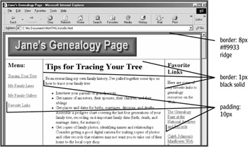
You can control basic table characteristics, such as margins, spacing, padding, and borders (see Figure 9.8):
<style type="text/css">
<!--
.hide { display: none; }
body { margin: 0; }
table { width: 100%; border: 8px #ff9933 ridge; border-
collapse: collapse; border-spacing: 0; }
td { padding: 10px; border: 1px black solid; }
td :first-child { margin-top: 0; }
-->
</style>
You may also notice that a .hide style is already included in the style sheet. That is because the Invisible Object method is used to alert users of earlier browsers that they need to upgrade their browsers, since this page utilizes styles.
The border property specifies the characteristics of the borders displayed around the table (the TABLE element) and the table cells (the TD element). You need to specify three border properties: a size, a color, and style. The border size can be set using pixels, ems, or percentages. The border color can be set using any of the 16 standard color names or an RGB hex code. Border styles that can be set include: solid, double, dashed, dotted, groove, ridge, inset, outset, and none (the default).
The border-collapse: collapse property collapses the spacing between table cells (substituting for a cellspacing="0" attribute in the TABLE element). The border-spacing: 0 property is also used, since Netscape 6 recognizes that property to collapse spacing between table cells, but does not recognize the border-collapse property. To set a specific amount of spacing between table cells, eliminate the border-collapse property (the default is border-collapse: separate) and set the amount of spacing you want using the border-spacing property.
The td :first-child selector stops the Mozilla browser from inserting vertical spacing above the initial block element in a table cell.
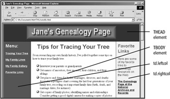
The THEAD, TBODY, and TFOOT elements are elements new to HTML 4 that allow the specification of display characteristics for table header, body, and footer sections. They are nested inside of the TABLE element and are used to apply display characteristics to nested rows or row groups. Like the SPAN and DIV elements, they have no formatting characteristics of their own and rely on styles to specify how they are displayed. Bracket the table's three rows with these elements:
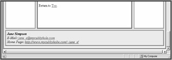
<table>
<thead>
<tr><td colspan="3">
<p><img src="genealogy.gif" width="500" height="75"
alt="Jane's Genealogy Page"></p>
</td></tr>
</thead>
<tbody>
<tr><td width="125" valign="top">
<h2>Menu:</h2>

[...]

<p>Return to <a href="tutor8c.html">Top</a>.</p>
</td></tr>
</tbody>
<tfoot>
<tr><td colspan="3">
<address>
<font color="navy">
<b>Jane Simpson</b><br>
E-Mail: <a href="mailto:jane_s@mycubbyhole.com">jane_
s@mycubbyhole.com</a><br>
Home Page: <a
href="/">http://www.
mycubbyholw.com/~jane_s/</a>
</font>
</address>
</td></tr>
</tfoot>
</table>
Next, create styles that use these elements to apply display characteristics to the table's contents (see Figure 9.9):
td { padding: 10px; border: 1px black solid; }
thead { text-align: center; color: yellow; background:
#003333; }
tbody { color: black; background: #ffffcc; }
tbody h1 { text-align: center; color: maroon; background:
transparent; font-family: Arial, Geneva, Helvetica, sans-
serif;     }
tfoot { color: navy; background: #ccffff; text-align: center;
}
td.leftcol, td.rightcol { font-family: Arial, Geneva,
Helvetica, sans-serif; }
td.leftcol { color: #ccffff; background: #990000; width:
130px; }
td.leftcol a { color: yellow; background: transparent;
font-weight: bold; font-size: .9em; }
td.rightcol { color: black; background: #ffcc99; width:
110px; }
td.rightcol a { color: navy; font-weight: bold; font-size:
.9em; }
td.rightcol h2 { color: #006666; background:
transparent; }
ul { list-style-image: url(ball_gold.gif);)
-->
</style>
The previous styles utilize class selectors to apply style properties to the content of specific table cells. The CLASS attributes have already been added to the example.
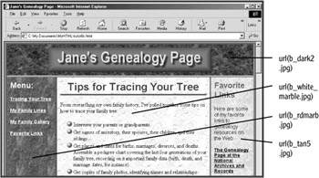
To further enhance the appearance of your layout, use styles to apply background images and borders to various elements in the table (see Figure 9.10):
td { padding: 10px; border: 1px black solid; }
thead { text-align: center; color: yellow; background:
#003333 url(b_dark2.jpg); }
thead td { border-bottom: 6px #ccff33 ridge; }
tbody { color: black; background: #ffffcc url(b_white_
marble.jpg); }
tbody h1 { text-align: center; color: maroon; background:
transparent; font-family: Arial, Geneva, Helvetica, sans-serif;
border-bottom: ridge 4px green; padding-bottom: 4px; }
tfoot { color: navy; background: #ccffff white url(b_paper
.gif); text-align: center; border-top: 6px #006699 groove; }
td.leftcol, td.rightcol { font-family: Arial, Geneva,
Helvetica, sans-serif; }
td.leftcol { color: #ccffff; background: #990000 url(b_rdmarb
.jpg); width: 130px; border-right: 4px aqua outset; }
td.leftcol a { color: yellow; background: transparent; font-
weight: bold; font-size: .9em; }
td.rightcol { color: black; background: #ffcc99 url(b_tan5
.jpg); width: 110px; border-left: 4px #996600 outset; }
You can use the position property to create a multi-column page layout without using any tables. For this example, you will be using a different example file. To get started with this example:
Open tutor8d_example.html in your text editor from your MyHTML folder (located in your My Documents folder, if using Windows, or on your Desktop, if using a Macintosh).
Resave tutor8d_example.html as tutor8d.html in the MyHTML folder.
Open tutor8d.html in your browser.
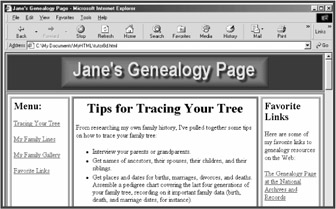
In this example, you will be using absolute positioning to create a page layout that features a masthead, three columns, and a footer. The example file has been set up for you so you only need to create the style sheet for the page (see Figures 9.11 and 9.12):
<style type="text/css">
<!--
.hide { display: none; }
body { margin: 0; color: black; background: #ffcccc;
font-size: 16px; }
p { font-size: 16px; }
.masthead { position: absolute; left: 0; top: 0; color:
black; background: #003366; padding: 5px; border: aqua 5px
ridge; width: 770px; voice-family: "\"}\""; voice-family:
inherit; width: 750px; }
html>body .masthead { width: 750px; }
.masthead :first-child { margin: 0; }

.mainbody { position: absolute; left: 0; top: 95px; color:
black; background: #ffcccc; padding: 5px; border: lime 5px
ridge; height: 143em; width: 770px; voice-family: "\"}\"";
voice-family: inherit; width: 750px; }
html>body .mainbody { width: 750px; }

.leftcol { position: absolute; left: 5px; top: 5px; color:
black; background: #ccffff; padding: 5px; border: yellow 5px
ridge; width: 145px; voice-family: "\"}\""; voice-family:
inherit; height: 95%; width: 125px; }
html>body .leftbar { width: 125px; }
.leftcol :first-child { margin-top: 0; }

.centercol { position: absolute; left: 155px; top: 5px;
color: black; background: #ffffcc; padding: 5px; border:
#ff9933 5px ridge; width: 140px; voice-family: "\"}\"";
voice-family: inherit; height: 95%; width: 430px; }
html>body .rightbar { width: 400px; }
.centercol :first-child { margin-top: 0; }
.centercol li { line-height: 1.1; padding-bottom: 2px;
padding-top: 2px; font-size: 16px; }

.rightcol { position: absolute; left: 610px; top: 5px; color:
black; background: #ccffcc; padding: 5px; border: yellow 5px
ridge; width: 145px; voice-family: "\"}\""; voice-family:
inherit; height: 95%; width: 125px; }
html>body .rightbar { width: 125px; }
.rightcol :first-child { margin-top: 0; }
.bottombar { position: absolute; left: 5px; top: 138.25em;
color: black; background: #ccccff; padding: 5px; border: aqua
5px ridge; width: 750px; voice-family: "\"}\""; voice-family:
inherit; width: 730px; }
html>body .bottombar { width: 730px; }
.bottombar :first-child { margin: 0; }
-->
</style>
The position: absolute properties specify that an element is positioned relative to its containing block. For divisions nested directly inside the document body, the BODY element is the containing block. The "leftcol," "centercol," and "rightcol" divisions, however, are nested inside of the "mainbody" division—the "mainbody" division is thus the containing block for those divisions.
The left and top properties are used in conjunction with position: absolute property to specify the position of the element relative to the left and top sides of the containing block. Thus, left: 0 and top: 0 position the "masthead" division zero distance from the left and top sides of its containing block (the BODY element).
This example makes use of the box model hack, which was mentioned in the previous session, to overcome Internet Explorer 5.5 for Windows's box model bug. Without use of the box model hack, the widths of the divisions would be different in Internet Explorer 5.5 for Windows than in other browsers, since that browser mistakenly includes any border or padding amounts in the element width.
The box model hack works because Internet Explorer 5.5 for Windows has a parsing error that causes it to ignore any style properties within a style rule declared following a specific set of codes: voice-family: "\"}\""; voice-family: inherit;. Other current browsers, however, ignore these codes and parse any property declarations that follow them in a style rule. This lets you set one element width before the codes, for Internet Explorer 5.5, and another element width after the codes, for other current browsers. For instance, the width of the "masthead" division should be 750 pixels, which is the element width set following the box model hack codes for that element. The element, however, also has borders and padding that add up to 20 pixels (5 pixels of borders and 5 pixels of padding on both sides of the element). To display the same element width in Internet Explorer 5.5, you need to set an element width of 770 pixels (750 + 20) before the box model codes that includes the borders and padding amounts.
The latest versions of the Opera browser also ignore properties set following the box model codes, but do not share the same box model hack, correctly calculating the width of an element excluding any border and padding amounts. This would be a problem, except that these versions of the Opera browser recognize properties set using a child selector, which is a CSS2 selector that Internet Explorer 5.5 does not recognize. Thus, the following line of code, html>body .masthead { width: 750px; }, reiterates the desired element width for the benefit of the Opera browser, but will safely be ignored by Internet Explorer 5.5. For a more complete explanation of the box model hack, see the page created by its discoverer, Tantek Зelik, at www.tantek.com/CSS/Examples/boxmodelhack.html.
This kind of page layout can only be created using fixed pixel font sizes and element widths. That is because relative font sizes and element widths set using ems make calculating how high column heights need to be impossible, since you can't predict the size of fonts that might be set in system or browser preferences, or in a user-defined style sheet. To create a fluid page design that includes a header (or masthead), columns, and a footer, you can use tables in conjunction with styles.
This was just a very brief, and relatively simple, example of creating a multicolumn page layout using only styles and without using tables. There is a good deal more that can be done, including overlapping absolutely positioned divisions. Normally, absolutely positioned elements overlap each other in the order in which they are inserted into the document. You can change the stacking order of positioned elements, however, by using the z-index property. A positioned element with a higher z-index property value (z-index: 5, for instance) is displayed on top of a positioned element with a lower z-index property value (z-index: 4, for instance).
The example only uses absolute positioning, but there are other forms of positioning that can be used, including relative and fixed positioning. Relative positioning positions an element relative to the element's insertion point within the document. Fixed positioning positions an element relative to the sides of the browser's viewport, allowing the creation of elements that remain fixed when the page is scrolled. Not all current browsers support fixed positioning (Internet Explorer 6, for instance, does not).
FIND IT ONLINE
To learn more about using Cascading Style Sheets, visit the W3C's Cascading Style Sheets page at www.w3.org/Style/CSS/.
|
|
Debugger script
Dhtml css